Google Chrome
Productivity, meet Individuality
In 2008, Chrome made the web work better, simplifying an experience that had become cluttered, clunky, and prone to crashing. But a lot’s changed since then. Social apps have become our new “browsing” platforms; and Chrome has become a place for more targeted discovery and real-world action-taking, a place where you do you. So we updated Chrome’s brand identity to depict a more personal kind of productivity—real people finding meaning in their daily activities, building confidence through accomplishment.
Our Role:
Research
Strategy
Visual Identity
Art Direction
Brand Voice
3D
Motion
Collaborators:
Interbrand, Arts & Letters
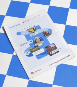
Picturing personality
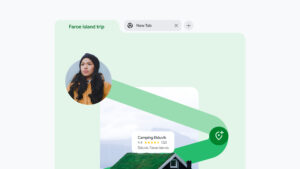
We designed a comprehensive system with abstracted Chrome UI and Material 3 color cues to tell stories of personal productivity, individuals using Chrome to boldly do the things they care about. Whether it’s repairing a well-worn pair of hiking boots or finding tickets to a sold-out concert in Budapest, Chrome helps you do more you.
Constructing our graphic language
Chrome used to have a simpler, type-driven visual identity. Once we decided to depict real-life Chrome usage, we had to start by creating a language of elementary shapes for holding a framing content. Our language takes inspiration from digital UI and the circular shape of the Chrome logo, which naturally morphs into lozenge shapes and rounded rectangles.
A system informed by product
Building on our graphic language, in collaboration with Chrome’s UX team, we elaborated four modes that reflect how people use their Chrome. Internal team members and agency partners can use these modes to tell stories about people finding things on the web, curating their interests, connecting the dots on their web journeys, and finally taking action.
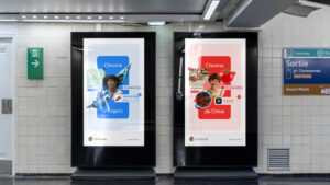
Clear UI is kind
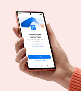
To streamline storytelling around key features, we reduced the complexity of Chrome’s product UI. Depending on the needs of a particular channel, UI can range from elements lifted directly from the product experience all the way to abstracted UI that only communicates the most pertinent information about a specific feature.
A marketing-friendly storytelling system
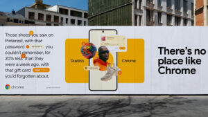
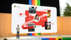
The magic happens when we combine our abstracted UI elements and UX modes to depict stories of personal productivity, individuals pursuing their interests with the help of Chrome. This combination allows Chrome to tell vivid, detailed stories of real and fictional users all over the world, while also communicating product messages.


Capturing Googliness
To align the new system with Google’s personality, we explored ways to dial up playfulness in execution. File names, Dino references, UI placement all became key in presenting a brand that wasn’t just product-centric and user-focused, but friendly and fun as well.